Event Projection & Drivers
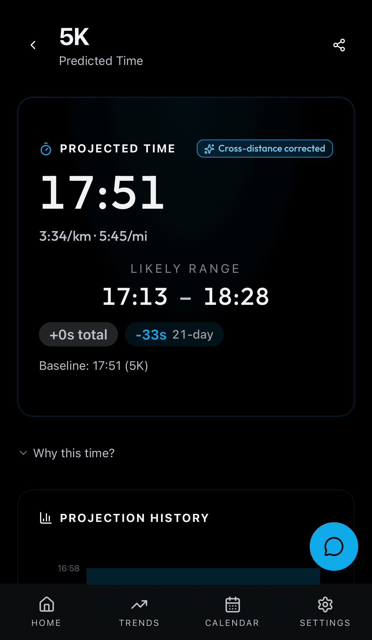
Source: src/app/(app)/event/[eventId]/page.tsx
What You See
A large finish time for the chosen event. Below are driver cards with colored dots matching each driver's color, bar charts showing contribution, display names, and navigation arrows. A projection history chart shows how this event's projection has changed over time. Trajectory scenarios (Maintain / Push / Ease Off) appear below. A share button opens the Share Modal with cohort benchmarks.
How the Numbers Work
Same projection engine as the dashboard but filtered to one specific event. The history chart plots every projection calculated for this distance. Driver contributions are the same five drivers but their seconds values are scaled to the specific race distance.
Step by Step
Models & algorithms used: DTW, Riegel
The event ID in the URL determines the distance. The backend runs the full projection engine at the 5K distance, then applies Riegel scaling (T2 = T1 * (D2/D1)^exponent) to convert to the requested distance. Driver contributions are scaled proportionally so they still sum to the total improvement for that distance. Projection history is read from the projection_history table filtered to this event. Trajectory scenarios use the same DTW or heuristic method as the dashboard 2-Week Trajectory but with the event-specific projection as the starting point. The share button loads cohort benchmarks for this event's distance from the weekly Celery-computed percentile table.