Physiology Trends
Source: src/app/(app)/physiology/page.tsx
What You See
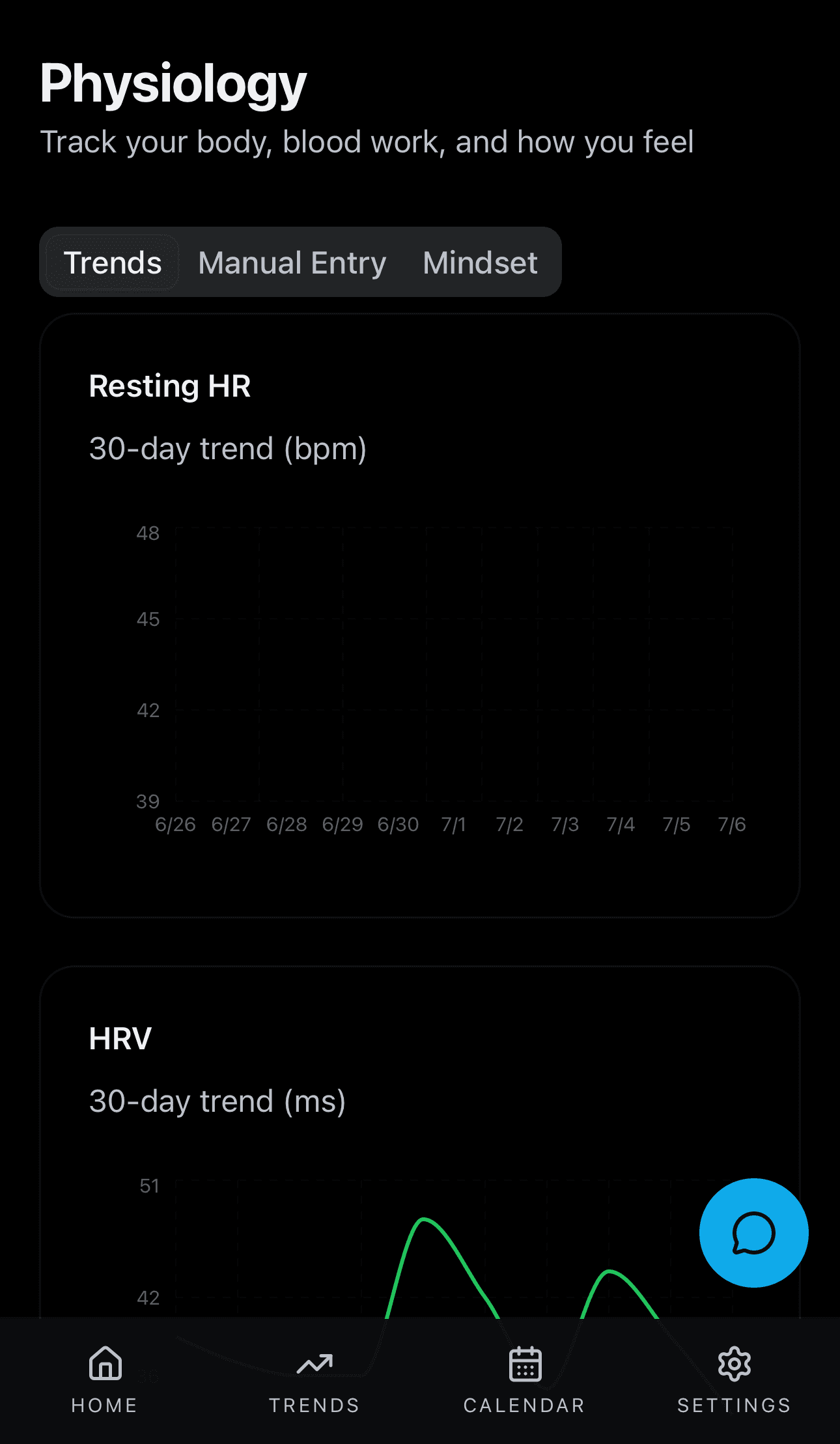
Line charts showing your resting heart rate, HRV, sleep score, weight, and body fat over time. Each chart automatically adjusts its scale to fit your data (so no data gets cut off). Below the charts is a form where you can log mindset and body notes manually.
How the Numbers Work
Each data point comes from your wearable's daily readings. The Y-axis of each chart is calculated dynamically: PIRX finds the minimum and maximum values in your data, adds 15% padding on each side, and uses that as the range. This means the chart always shows your data clearly, even if your values are outside typical ranges.
Step by Step
The backend queries the physiology table for the last 30 days. Each row was originally created by normalize_sleep_entry, normalize_body_entry, or normalize_daily_entry from Terra webhooks. The array of daily records is returned and split into individual charts in the browser (resting HR, HRV, sleep score, weight, body fat). The Y-axis range is calculated client-side: min and max values in the data, each extended by 15 percent padding, so the chart always fits your personal range. No ML is involved -- this is a direct time-series display of normalized wearable readings.