Share Modal / Race Card
Source: components/social/share-modal.tsx, race-card.tsx
What You See
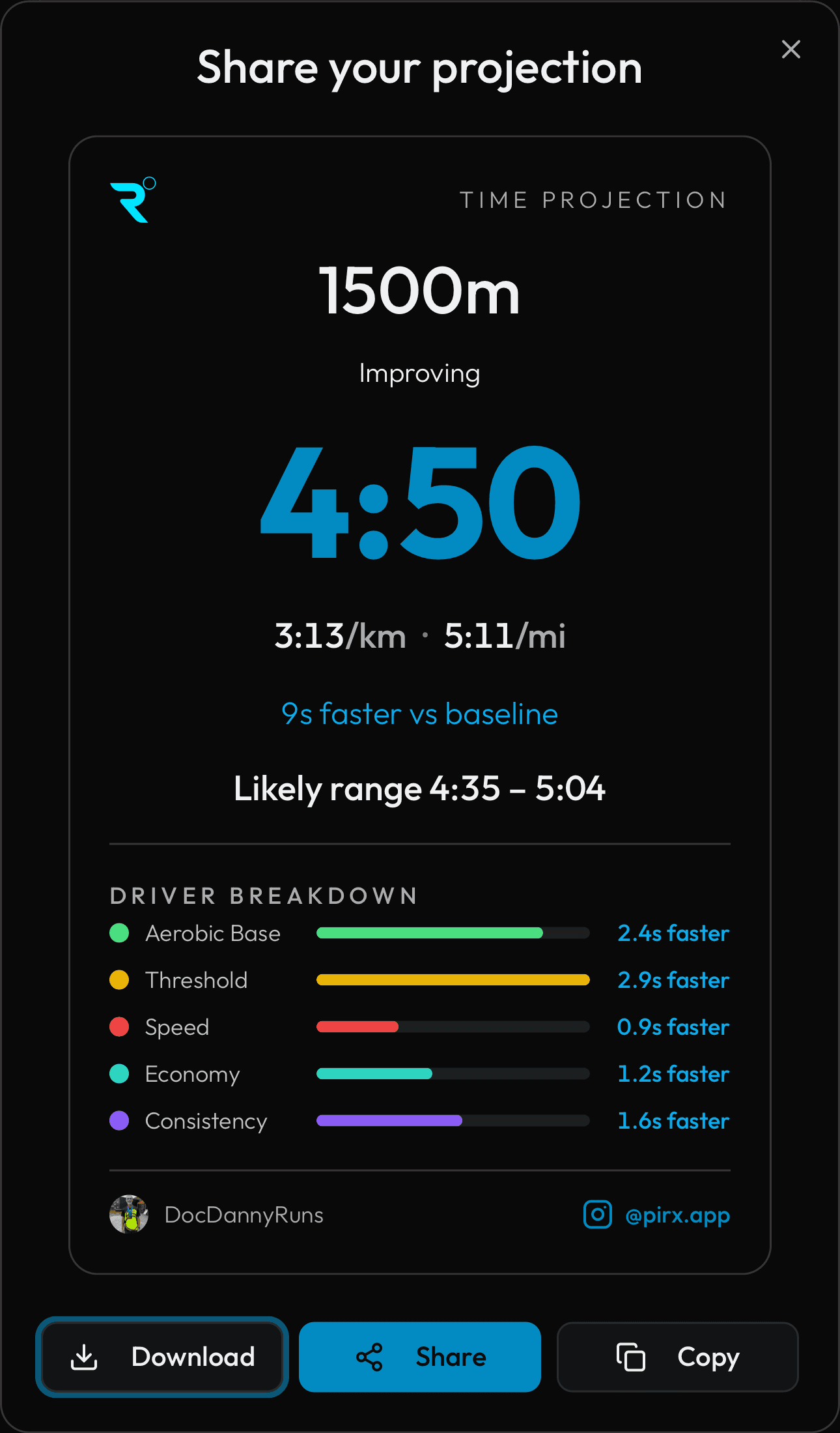
When you tap the share button, a popup appears with a branded card showing your projection, range, driver breakdown, and where you rank compared to other runners (cohort percentile). A horizontal benchmark scale shows tick marks for the 10th to 90th percentile times, with your position marked. You can download the card as an image or share it directly.
How the Numbers Work
The cohort percentile compares your projection to all other PIRX users running the same event. If you are in the 75th percentile, you are faster than 75% of runners. The benchmark scale shows the range of times from the 10th percentile (fastest) to the 90th percentile (slowest). Your marker position is calculated as a percentage between those two values.
Step by Step
Cohort benchmarks are computed by a weekly Celery background task that collects every opted-in user's midpoint_seconds for each event (minimum 5 users required). It uses numpy.percentile to compute the p10, p25, p50, p75, and p90 values. Your percentile rank is your position in the sorted list of all users expressed as a percentage. The benchmark bar on the card maps your time linearly between the p10 (fastest) and p90 (slowest) ticks. The card data (projection, range, improvement, drivers, name, avatar) comes from the same projection bundle used by the dashboard. The browser renders the Race Card component and converts it to a downloadable PNG using an HTML-to-image library.