Projection Tile
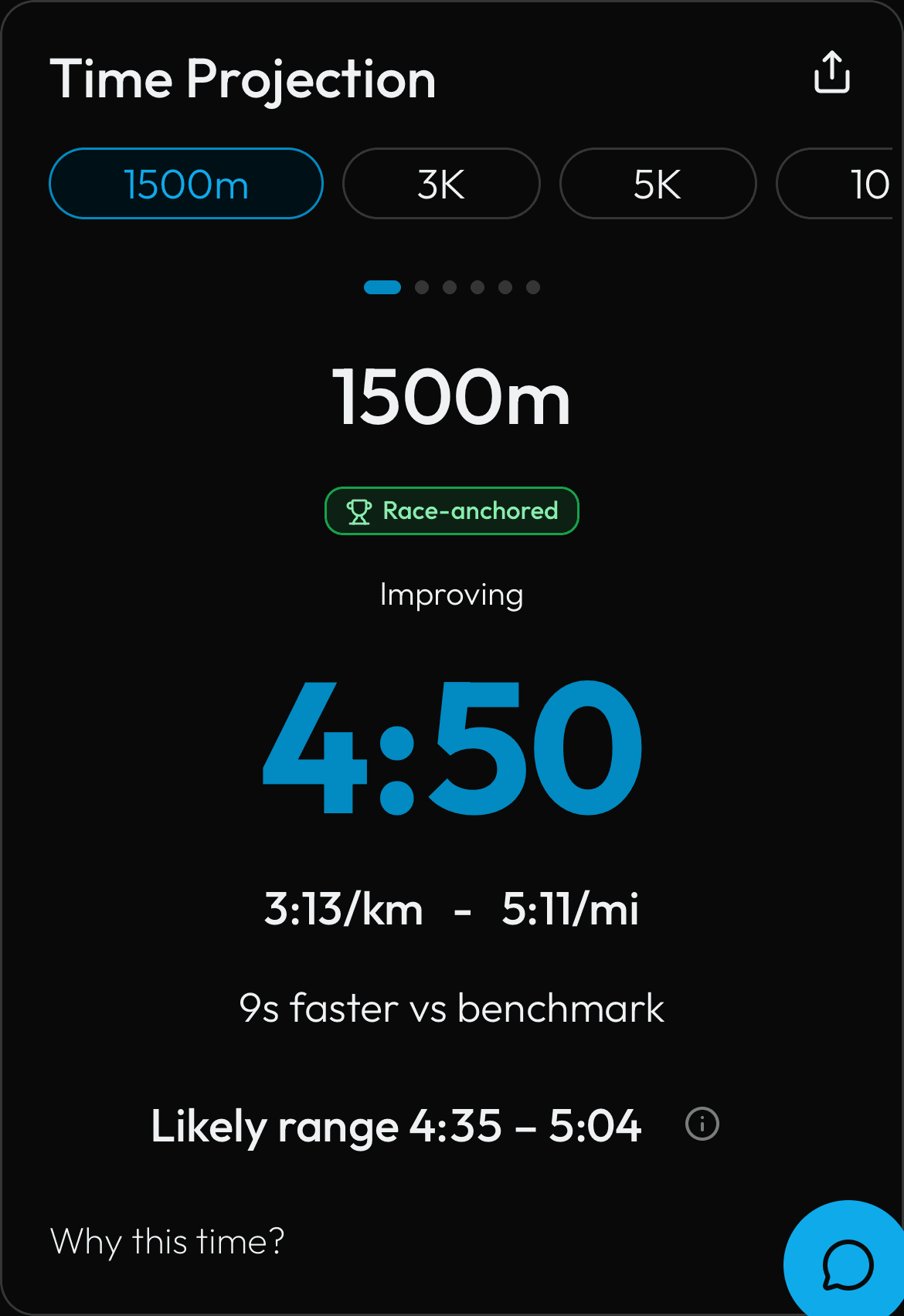
The main dashboard card showing your projected finish time, likely range, comparison to your benchmark, and a Race-anchored badge when the number is pinned to a real race.
Source: components/home/projection-tile.tsx
What You See
The main card on the dashboard, titled Time Projection. A row of distance pills (1500m, 3K, 5K, 10K, Half, Marathon) lets you switch events. For the selected event you see your projected finish time in large text (like '4:50' for the 1500m), the equivalent pace per kilometre and mile, and how you compare to your benchmark (for example '9s faster vs benchmark'). Below that is your likely range — the fastest and slowest finishes your current training supports. A green Race-anchored badge appears when the projection is pinned to a real race you ran (see Race-Anchored Projection). A trend word like 'Improving' shows the direction of your recent change. Tap 'Why this time?' to see each driver's contribution in seconds, and the share icon to create a race card.
How the Numbers Work
The projected time is calculated by the PIRX prediction engine. It starts with your baseline time (your most recent real race or a best estimate) and then adds or subtracts seconds based on five performance drivers. All of your training counts — including cross-training like cycling, swimming, and strength work, each weighted by how much it transfers to running. The likely range comes from a confidence interval around the prediction: more consistent data means a tighter range. If a real race contradicts the projection, the race wins — the projection is re-anchored to it and the Race-anchored badge appears.
Step by Step
Models & algorithms used: Gradient Boosting, Huber loss, KNN, LMC, LSTM, Local Matrix Completion, Riegel
- The projection engine runs a chain of calculations after every sync.
- Baseline: a 5-tier cascade finds your starting time -- first it looks for a real race where your heart rate hit at least 83 percent of your max; if none, a sustained effort of 3+ km at 85 percent HR; then a discounted fast-pace estimate; then an adjusted median; last resort is a 25:00 default. Non-5K races are converted using the Riegel power-law formula. If race data is too sparse, a Local Matrix Completion (LMC) rank-2 model or a KNN cold-start lookup (k=3 similar runners) sets the baseline.
- Features: rolling distances over 7/21/42/90 days, zone percentages, threshold and speed minutes per week, matched-HR-band pace, HR drift, weekly load standard deviation, ACWR (Exponentially Weighted Moving Average of 7-day load divided by 28-day load).
- Driver scores: each feature is divided by a baseline reference value, multiplied by 50, and clipped to 0-100; ACWR uses a U-shaped curve centered on 1.05.
- Total improvement: the weighted mean of all driver scores minus 50, divided by 50, times 25 percent of your baseline time.
- Noise dampening: the new projection is blended with the previous one using a smoothing factor between 0.3 and 0.7 (skipped if the baseline shifted more than 5 percent).
- Range: starts at 1.5 percent of the projected time, plus a volatility term (capped at 5 percent), plus a data-quality gap term, plus 1 percent if ACWR is above 1.5 or below 0.6.
- ML override: if a trained Gradient Boosting model (200 trees, Huber loss, 17 features) or LSTM neural network (sequence length 11, hidden size 17, 50 percent dropout) is available, it can replace the midpoint while keeping the deterministic driver breakdown. The 21-day change compares today's stored projection to the one saved 21 days ago.