Weekly Volume Chart
Source: components/home/weekly-volume-chart.tsx
What You See
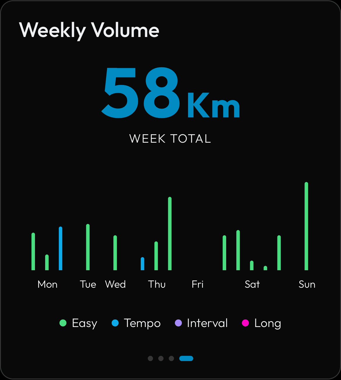
A bar chart showing your running volume for the current week. Each individual run is its own bar, colored by intensity: green for Easy, blue for Tempo, purple for Interval, and pink for Long. If you did multiple runs in a single day, each run appears as a separate bar. The total weekly distance in kilometers is shown in the top right. Swipe left/right to view previous weeks.
How the Numbers Work
PIRX looks at all your activities from this week and classifies each one by intensity: Easy, Tempo (threshold/tempo types), Interval (interval/speed types), or Long (15 km or more). Each run is shown individually so you can see how your training sessions are distributed across the week. The total is the sum of all distances for the week.
Step by Step
The backend classifies each run by its activity type label. Runs labeled tempo or threshold are classified as Tempo. Runs labeled interval or speed are classified as Interval. Runs with distance at or above 15 km are classified as Long. Everything else is Easy. The calendar week starts on Monday. The backend returns one entry per run (not aggregated per day), sorted by timestamp within each day. Days with no runs show an empty placeholder to preserve the weekly grid. The chart renders each entry as its own bar colored by intensity type. The x-axis shows the day abbreviation on the first run of each day and is blank for subsequent runs on the same day.