5K Projection Over Time
Source: components/charts/projection-history-chart.tsx
What You See
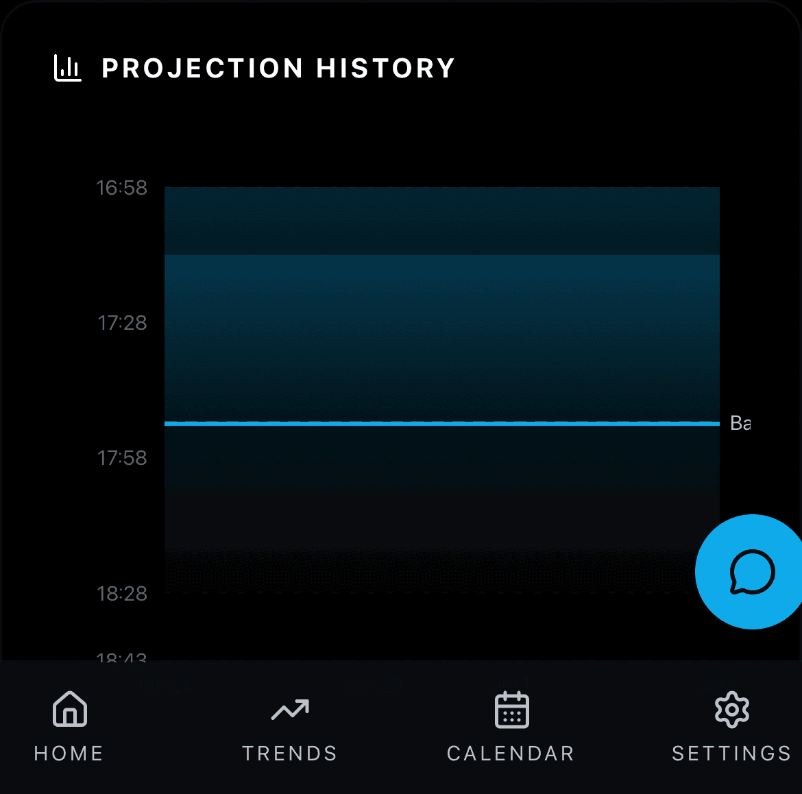
A line chart showing how your 5K projected time has changed over the last 90 days. The line goes down when you are getting faster and up when you are getting slower. There may be a shaded band around the line showing the confidence range.
How the Numbers Work
Each point on the chart is the projected time PIRX calculated on that date. The shaded band shows the best-case to worst-case range for each day. If the line trends downward, your fitness is improving.
Step by Step
Every time the projection engine runs (after each sync), it saves a row to the projection_history table containing: date, midpoint seconds, low bound, high bound, model name, and confidence. The chart reads up to 90 days of these rows. If a structural shift is detected (the projection jumps by more than 2 seconds between consecutive rows), a vertical marker is placed on the chart. Structural shifts can come from baseline recalibration, a new ML model being activated, or a large improvement/decline after the dampening step. The shaded band is drawn from the low/high range values at each point. A horizontal reference line marks your baseline time.